Serenity & Rose Quartz
For the first time, Pantone has not one but two colours of the year, “Rose Quartz” and “Serenity. These shades, Pantone say, were chosen to convey rosy warmth and tranquillity.
“We wanted compassion, which today a lot of people are looking for,” Ms. Eiseman says. Pantone’s news release describes the colours as “inducing feelings of stability, constancy, comfort and relaxation,” and argues that they “create balance in a chaotic world.” Leatrice Eiseman, Executive director of Pantone’s Colour Institute.
A softer take on colour for 2016. Representing a mindset of tranquillity and inner peace Pantone announces PANTONE 13-1520, Serenity, and PANTONE 15-1319, Rose Quartz, a harmonious pairing of complementary shades as our colours of the year for 2016.
Weightless and airy, like the expanse of the blue sky above us, Serenity comforts with a calming effect, bringing a feeling of respite even in turbulent times, while Rose Quartz is a persuasive yet gentle tone that conveys compassion and a sense of composure.
Approachable and welcoming, in tandem these subtle and discerning hues convey a message of connection and wellness; evoking an easy, calm, embracing and restful mood.
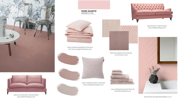
GET THE LOOK…


EXCLUSIVE THE PANTONE COLLECTION of ART PRINTS from www.Art.co.uk